


You know the feeling. You set your product on the table, snap a few photos, and somehow the thing you made with real care looks dull, crooked, or strangely cheap on screen.
That disconnect hits a lot of independent brands hard. The coffee looks flat instead of rich. The skincare jar looks gray instead of creamy. The candle label is technically visible, but the whole photo feels like an afterthought. And when people buy online, especially from local makers they're discovering for the first time, the photo has to carry a lot of trust.
The good news is you don't need a full studio to fix that. You need a repeatable setup, a few smart habits, and a better sense of what buyers are looking for when they scroll.
Table of Contents
Great Photos Sell Great Products
A maker can spend weeks getting a formula right or refining packaging, then lose the sale because the first product image looks dark and uncertain. That's the frustrating part of selling online. The product can be excellent, but the customer only sees what the camera gives them.
The significance of this is often overlooked. BigCommerce notes that professional photography can drive 75% higher conversions, and shoppers are 3× more likely to engage with products presented with strong visual content. For independent brands, that's not a styling detail. It's the difference between “maybe later” and “add to cart.”
Your photo is the first handshake. If it feels sloppy, buyers assume the product might be too.
The encouraging part is that “professional” doesn't have to mean expensive. It usually means clean prep, consistent light, honest color, and enough angles to remove doubt. A well-shot jar of body scrub or a bag of coffee can feel trustworthy with nothing more than a phone, a window, and some patience.
If you want extra help with cleanup and background work after the shoot, this guide to AI product photography is a useful companion. It's especially handy when you already have decent photos and want to make them cleaner without rebuilding your whole workflow.
For makers building a direct-to-customer presence, Loyaltie seller resources are also worth bookmarking. They're practical if you're working through the bigger picture of how your catalog should look when people discover and buy directly from the maker.
First Things First Prepping Your Product
Before you adjust lighting or open your camera app, fix the product itself. Cameras are rude. They notice lint, fingerprints, bent labels, tiny leaks, and wrinkles you missed with your own eyes.
A product that looks polished in person can still photograph badly if it isn't photo-ready. Glass shows streaks. Metal shows smudges. Paper labels reveal every tiny misalignment. Fabric looks tired if it isn't steamed.
The prep checklist I'd treat as non-negotiable
- Wipe every surface: Use a microfiber cloth on jars, bottles, metal, and plastic. A shiny surface can go from “clean enough” to “covered in fingerprints” the second you see it on a larger screen.
- Fix the label: If the front label is slightly tilted, your viewer will feel that something is off even if they can't name it.
- Trim distractions: Loose threads, dented corners, and torn seals pull attention away from the product itself.
- Shape soft goods: Tissue paper, stuffing, clips, or a quick steam can give pouches, wraps, and bags a cleaner silhouette.
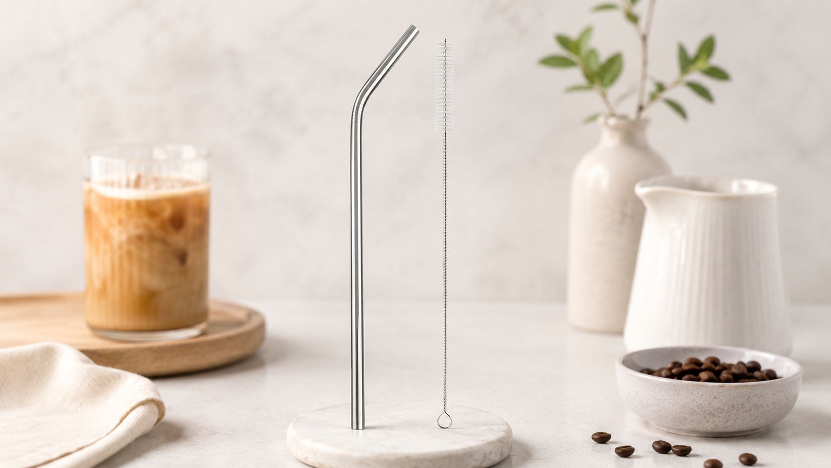
For a product like Stainless Steel Reusable Drinking Straw + Cleaning Brush, Eco-Friendly, Dishwasher Safe, Rust-Resistant, 1 Set | Ube Superfood by Loyaltie, prep matters because reflective metal exaggerates every mark. The snapshot says it's designed for daily iced coffee and latte use, won't warp, stain, or hold odors, and includes a snug cleaning brush. That kind of product needs a spotless surface and tidy placement, or the photo quickly feels messy.
Practical rule: If cleaning the product takes two minutes now, it can save you much longer in editing later.
This is also where staging starts. Even if you're not shooting furniture, the discipline behind furniture product staging techniques is useful. The core idea is simple. Control what enters the frame. Every visible detail should make the product look clearer, not busier.
Find Your Light with Natural and DIY Setups
Light decides whether your product looks soft, fresh, textured, glossy, cozy, clinical, or forgettable. Most photo problems that get blamed on the camera are lighting problems.
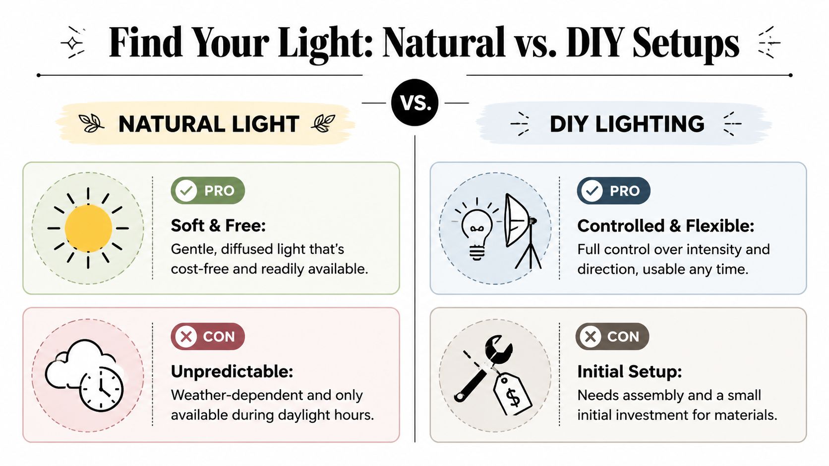
Natural window light and a DIY lighting setup can both work beautifully. They just solve different problems.
When window light is the better choice
Window light is often the easiest place to start because it already looks flattering. Put your setup near a bright window with indirect light, then place a piece of white foam board opposite the window to bounce some light back into the shadow side. That one move can make a product look far more balanced.
Natural light works especially well for products that benefit from warmth and softness. A body scrub, candle, coffee bag, or wellness product often looks more inviting this way. A product like Foaming Sugar Scrub, White Sugar & Sunflower Oil, Exfoliating + Hydrating Cleanse, 6 oz Jar | Present Day Goods by Loyaltie suits that kind of setup because the texture and overall feel matter as much as the jar itself. The catalog snapshot describes a foaming sugar scrub made with fine white sugar and sunflower oil, so a soft side light can help the product read as tactile and cared-for instead of flat.
The downside is consistency. If a cloud rolls in or you shoot at a different time tomorrow, your photos can shift in brightness and color.
When a DIY setup makes life easier
A DIY lightbox or simple tabletop setup with diffused lamps gives you more control. You can build one with a cardboard box, tissue paper, white poster board, and a pair of lights placed outside the sides. That setup helps when you need repeatable catalog photos with a clean background.
Here's a quick comparison:
| Setup | Best for | What works | What gets annoying |
|---|---|---|---|
| Window light | Lifestyle-feeling images | Soft, natural look with very little gear | Changes with weather and time of day |
| DIY lightbox | Cleaner catalog shots | More consistency and easier repeat shoots | Takes setup time and can feel less natural |
If you want to refine your artificial light setup, Display Guru's lamp guide is useful for thinking through lighting shape and placement. You don't need that exact setup to learn from it. The helpful part is seeing how controlled light changes shadows and reflections.
Soft light is usually the safer choice. Harsh light can work, but it makes every flaw louder.
A white board, a black board, and a sheer curtain can do a lot. White fills shadows. Black adds contrast around glossy edges. A curtain over direct sun turns ugly glare into usable light. Budget gear works when you use it on purpose.
Compose Shots That Tell a Story
Once the light is doing its job, composition takes over, making the image feel intentional instead of accidental.
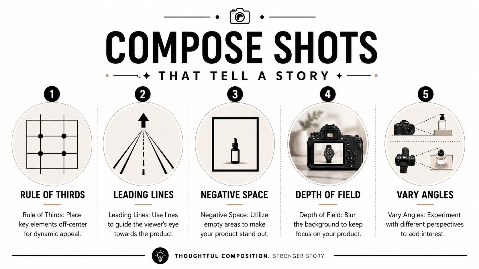
A lot of makers overcomplicate composition, but you really need a few dependable tools. Canva's basic guidance on the rule of thirds is still useful: divide the frame into three rows or columns and place the product slightly off-center for a more balanced image. That small shift often feels more natural than putting everything dead center.
The four shots worth getting every time
You don't need dozens of random photos. You need a set that answers different buyer questions.
- Hero shot: This is the clean, obvious image. It should show the full product clearly and quickly.
- Detail shot: Get close enough to show texture, finish, label quality, or ingredient cues.
- Angle shot: A side or three-quarter view adds dimension and helps the product feel real.
- In-context shot: Show the product where it belongs so the buyer can picture it in daily life.
For a candle, that in-context image might be on a bedside table or shelf, not floating in a blank void. If you sell something like this romantic floral wood wick candle, the buyer isn't only checking the vessel. They're imagining mood, placement, and whether it feels gift-worthy.
Composition that works on a phone screen
This matters more now because shopping behavior is increasingly mobile-first. Orbitvu notes that visual presentation now needs to support fast recognition and visible differentiation at thumbnail size, helping lower return rates and build trust on small screens.
That changes how you compose. Tiny props, busy backgrounds, and low-contrast styling might look fine on a laptop and fail completely on a phone.
Try these checks before you call a photo done:
- Zoom out to thumbnail size: Can you still tell what the product is?
- Check the silhouette: Does the outline read clearly against the background?
- Leave some negative space: Crowding the frame can make the image feel noisy.
- Vary your height: Eye-level, top-down, and slight angle shots each tell a different story.
If the product disappears when the image gets small, the composition isn't doing enough work.
Nail the Shot with Your Phone or Camera
Good product photography tips should work whether you're using the phone already in your hand or a camera you bought secondhand. The difference is less about status and more about control.
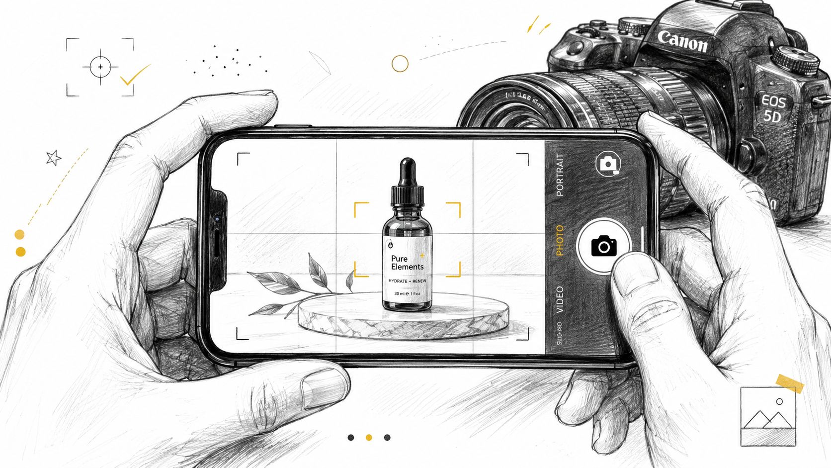
If you are shooting with a phone
Phones do a lot well, especially in good light. The problem is that they also make a lot of choices for you. Sometimes those choices help. Sometimes they flatten the product, shift the color, or brighten the background so much that the packaging loses detail.
A few habits make phone photos much better:
- Tap to focus on the product: Don't let the phone decide the focus point.
- Adjust exposure by hand: If the white background looks bright but the label loses detail, pull the exposure down a little.
- Use a mini tripod: Handheld product shots often look sharp on the phone screen and soft once you review them properly.
- Avoid digital zoom: Move the phone physically closer instead.
- Test Portrait mode carefully: It can look nice for lifestyle images, but fake blur around edges can look messy on packaging.
A steady phone setup works especially well for mugs, jars, soaps, and pouches. If you were photographing a black gloss ceramic coffee mug, for example, the key challenge wouldn't be megapixels. It would be managing reflections on the glossy surface and keeping the rim, handle, and body all looking clean and true.
If you are shooting with a camera
With a camera, start simple and stay repeatable. Soona recommends a baseline of ISO 100, f/8 to f/11 (and up to f/16 for deeper depth of field), a tripod, and manual white balance for technically consistent product photography. Those settings help minimize noise, keep the product sharp, and hold color more steadily across a catalog.
That baseline works because product photography usually rewards clarity over drama. A low ISO keeps grain down. A narrower aperture helps more of the product stay in focus. A tripod removes camera shake. Manual white balance prevents your product from looking warm in one photo and cool in the next.
Here's a clean workflow I'd use every time:
| Step | What to do | Why it helps |
|---|---|---|
| Lock the camera down | Put it on a tripod and frame the shot | Consistent composition and sharper images |
| Set exposure basics | Start low ISO and a narrower aperture | Cleaner files and more product detail |
| Use manual focus | Focus on the front detail that matters most | Prevents focus drift on static subjects |
| Review larger | Check on a bigger screen if possible | Easier to catch blur, glare, or crooked labels |
A short demo can help if you learn better by watching a setup in motion:
Field note: Auto white balance and autofocus are convenient, but they're often the reason one product image doesn't match the next.
If your camera can shoot RAW, use it. RAW files preserve more image data, which gives you more room to correct color and exposure later without the image falling apart.
Simple Edits to Make Your Photos Pop
Editing is where you clean up the small stuff and make the image match what the product looks like in front of you. It should feel like finishing, not rescuing.
You don't need a heavy edit to get a stronger result. In most cases, a few thoughtful changes do most of the work. Snapseed and Lightroom Mobile are both plenty capable for this level of editing, especially if you're working from a phone.
The edits that matter most
Start with the basics in this order:
- Crop and straighten: A slightly crooked label or horizon line makes the whole image feel off.
- Adjust brightness carefully: Lift the image enough to feel clean, but stop before highlights lose detail.
- Correct white balance: If your cream-colored lotion looks blue or yellow, trust drops fast.
- Add a little contrast: This can help the product separate from the background.
- Use sharpening lightly: Enough for crispness, not enough to create crunchy edges.
A good edit should make the product look more believable, not more processed.
Small edits done consistently beat dramatic edits that change from image to image.
The clean white background move
If you want that marketplace-ready white background, the polished version usually happens in two stages. First, create some physical separation between the product and the backdrop during the shoot. Then refine the background in editing.
Visual Education explains that a professional workflow for white-background photography often involves physically separating the product from the background and carefully adjusting exposure in post-production to get a clean result without losing product detail or creating halos. That warning matters. A too-aggressive background edit can make edges glow, labels clip, and glossy packaging look fake.
For cleaner packshots, it also helps to keep the final crop tight enough that the product fills most of the frame. Industry guidance commonly recommends a pure white target of RGB 255, 255, 255 and cropping so the product fills about 80 to 90% of the frame, which keeps the image readable and consistent across product listings.
When your images are ready, where you show them matters too. Loyaltie is a marketplace where people discover and buy directly from the best independent brands in the US, so clearer photos help your products communicate quality and trust the moment someone finds them.