
You just placed an order for hand-roasted coffee, a magnesium blend, or a better-for-you skincare product from an independent maker. The checkout went through, your card was charged, and then you wait. You want proof the order is real, a clear idea of when it will arrive, and a quick signal that the person behind the brand is legit.
That same tension hits sellers too. A local maker gets the sale, feels excited for about five seconds, then starts risking avoidable support messages with one weak confirmation email. If that email looks like a generic receipt, it leaves money and trust on the table. If it answers the right questions fast, it calms the buyer and sets up the next sale.
That's why I take the order confirmation email seriously. It isn't admin. It's one of the strongest messages in your whole customer journey. Order confirmation emails convert 22 times better than standard campaign emails, which is exactly why local makers should treat them like a revenue asset, not a box to check, according to Omnisend's email marketing statistics. If you sell direct and want a cleaner post-purchase flow, the practical starting point is your setup inside Loyaltie seller resources.
Table of Contents
- Put the essentials at the top
- Add delivery details that fit local reality
- Keep promotional content restrained
- The trigger sequence that makes sense
- Build around local handoff points
- Don't let failed sends sit quietly
- What a good mobile template includes
- What to place above the fold
- Template decisions for direct-from-maker brands
- The metrics that actually matter
- What to review every month
- Run small tests, not big redesigns
- The long-term win
Introduction to Order Confirmation Emails for Local Makers
If you sell products made by real people, your post-purchase email has to do more than confirm payment. It has to calm the exact questions buyers ask after checkout. When will this ship. Is this maker verified. Is delivery coming by carrier, local courier, or direct handoff.
That matters even more when you sell coffee, wellness, food, pet products, or skincare through independent brands. People buy these categories because they want something better than mass-produced basics. They care about ingredients, sourcing, freshness, and who made it. Your order confirmation email should reflect that level of care right away.
Why local commerce needs a different email
A warehouse-style template usually fails local makers because it assumes every package moves through a standard fulfillment chain. That's not how many direct-from-maker orders work. Some are packed same day. Some are batched. Some are dropped off locally. Some are delivered by the maker or a neighborhood courier.
Buyers don't mind waiting when you set the expectation clearly. They mind uncertainty.
A strong order confirmation email gives the buyer the receipt they expect and the reassurance they didn't get from checkout alone. It also protects the relationship you just earned. That's especially important when people discover and buy directly from the maker instead of through a national chain.
Identify Must-Have Elements for Strong Confirmation Emails
Most confirmation emails fail in one of two ways. They either hide the key order details under branding and fluff, or they cram in offers before the buyer has basic clarity. Don't do either.
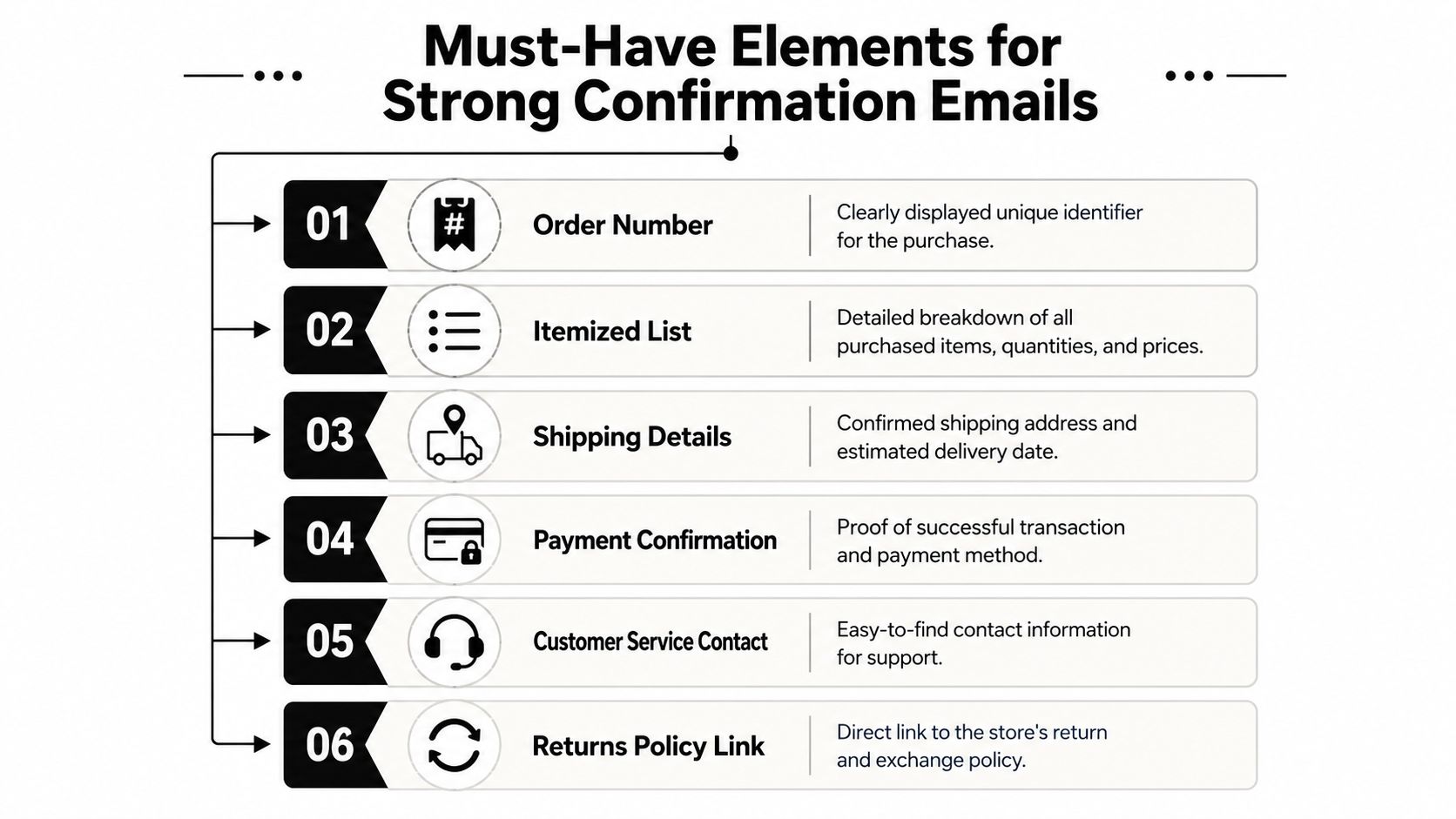
The structure should be simple. Put the transaction first. Put everything else after that. The best framework is an 80/20 split, with 80% functional transactional data and 20% promotional content, based on Litmus guidance for optimizing order confirmation emails.
Put the essentials at the top
Your buyer should open the email and instantly see the facts that matter.
- Order number first: Make it obvious and easy to find. If a customer contacts you, this is the fastest reference point.
- Itemized product list: Show what they bought, in plain language. Include quantity and individual line items so nothing feels vague.
- Pricing breakdown: Spell out subtotal, shipping, tax, discounts, and final amount paid. Confusion here creates distrust fast.
- Billing and delivery details: Show both clearly so the customer can catch mistakes before fulfillment moves forward.
- Payment method confirmation: State the payment method used so the customer knows the transaction processed correctly.
- Support contact info: Put a reply path in the email itself. Don't make buyers hunt through your site.
Add delivery details that fit local reality
Local makers must excel beyond generic ecommerce templates. “Estimated delivery date” is often too thin. If your process includes roasting days, production windows, local courier schedules, or maker drop-off routes, say that plainly.
For example, a better delivery line is not “Ships soon.” A better line is “Your order is being packed by the maker. You'll receive a follow-up once it's handed to local delivery.” That gives context. It lowers anxiety. It stops the customer from assuming Amazon-style fulfillment when that's not your model.
Practical rule: If a buyer has to email you to understand what happens next, your confirmation email is incomplete.
Keep promotional content restrained
You can add one value-add block near the bottom. That might be a reorder reminder option, a loyalty prompt, or a helpful product care tip. Keep it secondary.
A confirmation email should feel like a clean receipt with useful guidance, not a crowded campaign. That's how you preserve trust right after purchase.
Craft Compelling Subject Lines and Personalize Your Messages
Your subject line has one job. It should instantly confirm the purchase. Cute subject lines that hide the purpose are a mistake. Save personality for the preview text and opening sentence.
The best subject lines are boring in the right way. They're clear, fast to scan, and easy to trust in a crowded inbox.

Subject lines that work
Use formulas like these:
- Your order is confirmed
- Order received from [Brand Name]
- Thanks, [First Name]. Your order is confirmed
- Your [Brand Name] order is in progress
- Order confirmed. Delivery details inside
If your brand has a strong local identity, you can add a light human touch without burying the point. “Your order from Asheville Coffee Co. is confirmed” works. “Good things are brewing in North Carolina” does not work as a primary subject line because it hides the transaction.
Personalization that helps, not clutters
Personalization should reduce friction. It shouldn't feel decorative.
Use:
- first name
- maker name
- product name
- delivery method
- location-specific note when relevant
Avoid stuffing too many fields into the subject line. Broken personalization kills trust faster than no personalization at all.
A simple opening like “Thanks, Maya. We've received your order and the maker is preparing it now” feels personal because it answers the buyer's next question. That's enough.
Use product names naturally
If someone ordered One-Shoulder Cutout One-Piece Swimsuit, Marble Print, Removable Cups, Fully Lined, Cheeky Fit, Women's Size | FloridaBorn Vintage Fashion by Loyaltie, the confirmation should repeat that exact product name in the order summary, not shorten it into something vague like “swim item.” The snapshot matters. The buyer wants to verify they ordered the right piece. In this case, the product details are straightforward: a marble-print one-piece with a one-shoulder cutout, full lining, removable cups, and a cheeky fit.
Clear product naming reduces second-guessing right after checkout.
If you want personality, put it in the opening line or footer. Keep the subject line and order summary crisp.
Automate Timing to Boost Open Rates and Trust
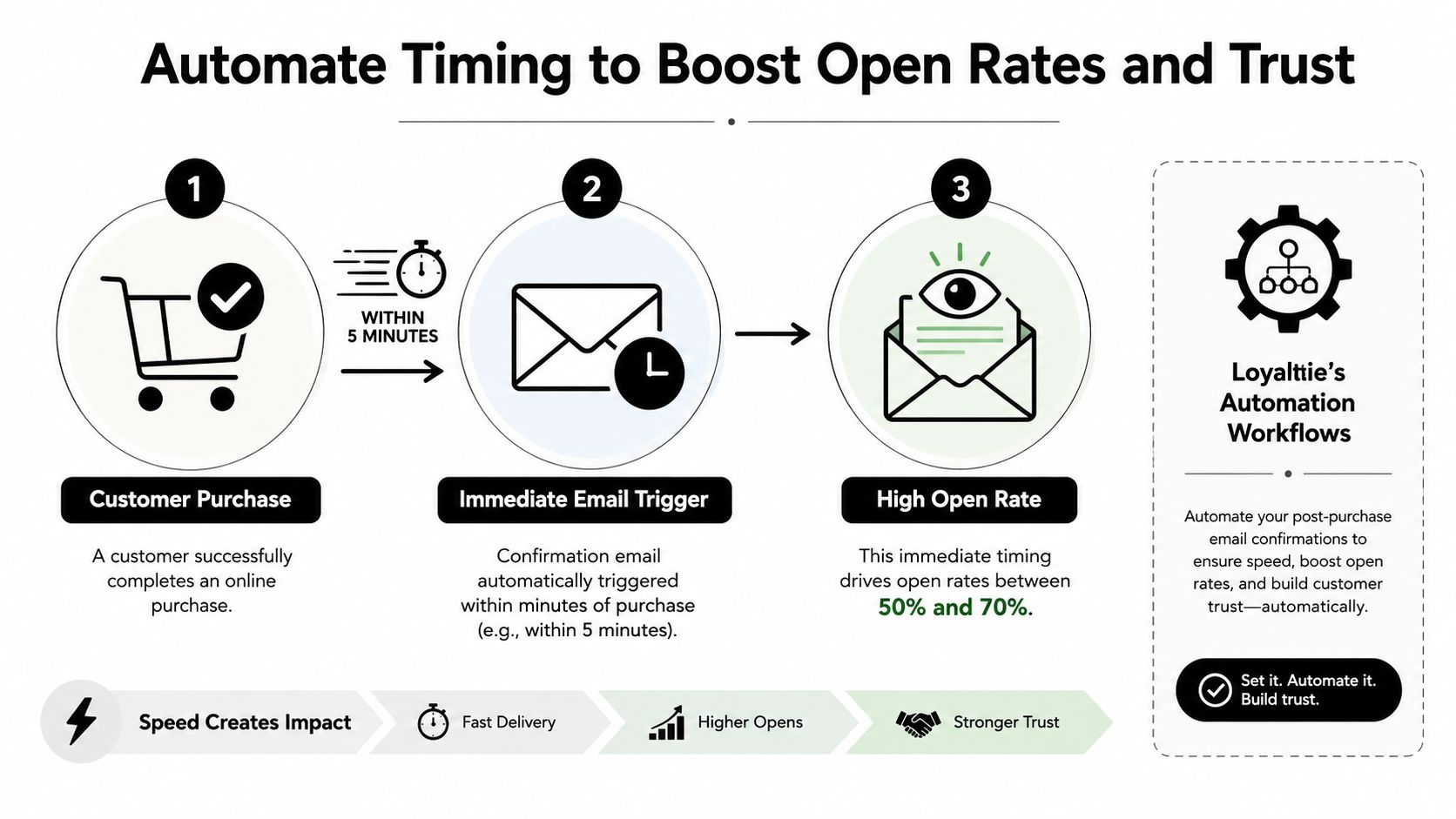
Timing is where strong confirmation emails become dependable. If the email arrives quickly, the buyer relaxes. If it lags, the buyer starts wondering whether payment went through, whether the order failed, or whether the seller is disorganized.
The industry benchmark for open rates on transactional emails sits between 50% and 70%, and that range is tied to immediate delivery within minutes of purchase, according to MailerToGo transactional email engagement statistics.
The trigger sequence that makes sense
Your automation should fire from the actual purchase event, not from a delayed batch process. The cleaner flow looks like this:
- Payment succeeds
- Order record is created
- Confirmation email sends immediately
- Fulfillment note updates later if needed
- Tracking or local delivery update follows in a separate message
That sequence matters because confirmation and shipment are not the same thing. Don't wait for fulfillment data before confirming the order itself.
Build around local handoff points
Local commerce adds a few practical trigger points that national templates often ignore:
- Maker acceptance: Useful when items are made or packed by the seller after purchase.
- Inventory confirmation: Helpful if the seller manages limited runs or fresh production.
- Local courier handoff: Important when the order doesn't move through standard parcel tracking.
- Delivery window update: Necessary when fulfillment depends on neighborhood routes or same-area drop-offs.
If you're comparing workflow ideas, this guide to streamlining customer email communication is useful because it frames automated customer emails around operational events rather than one-off sends.
Here's a useful visual example of how this timing flow should feel in practice.
Don't let failed sends sit quietly
If a confirmation email fails, you need a retry rule. The customer should not be the first person to discover the issue. Set alerts for delivery failures and have a backup process for resends after the order event is verified.
That's not fancy lifecycle marketing. It's basic operational discipline. In post-purchase communication, speed builds trust, but reliability keeps it.
Optimize Mobile Design and Use Effective Templates
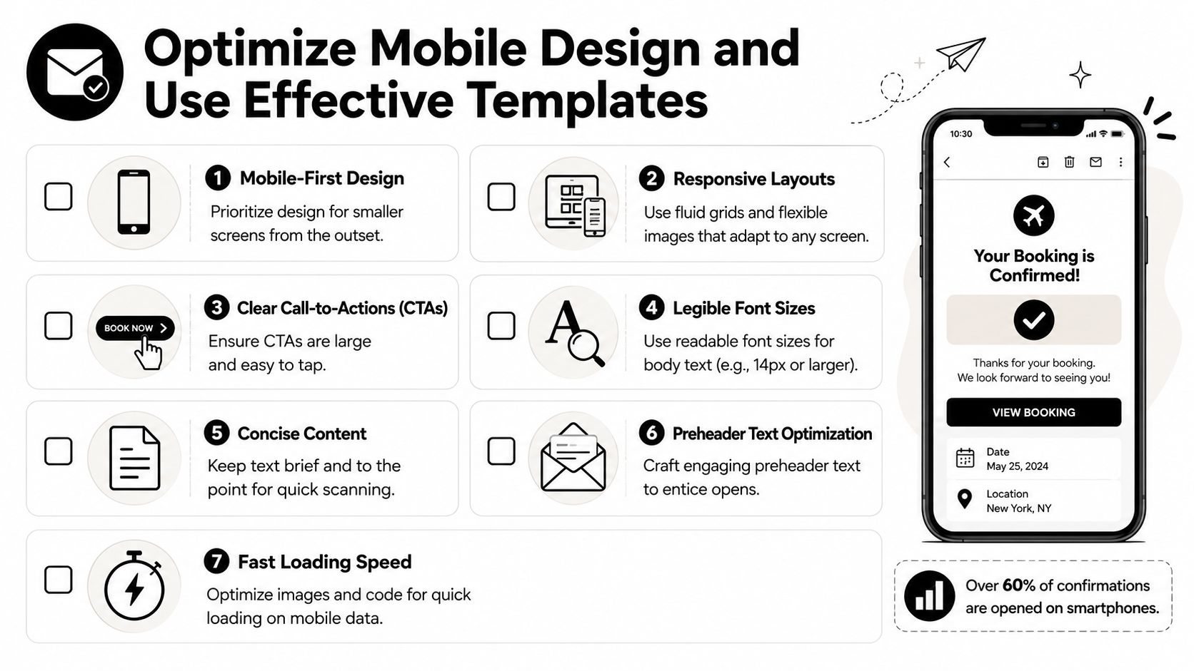
Most buyers read confirmation emails on their phones, often within minutes of purchase while they're still moving through their day. If your email forces pinching, zooming, or hunting for order details, it feels sloppy.
Litmus notes that over 60% of transactional emails are opened on mobile devices in its best-practices guidance for optimizing order confirmation emails. That's enough reason to design for mobile first, not desktop first.
What a good mobile template includes
A useful order confirmation email template for local makers should be visually quiet. This isn't the place for layered banners or long brand storytelling.
Use:
- A single-column layout: It keeps order details easy to scan.
- Short text blocks: Buyers should read the key facts without scrolling through filler.
- Large tap targets: Tracking, support, and order-view buttons must be easy to tap.
- Readable type: If the buyer has to zoom in to read an address or delivery note, the design failed.
- Compressed product images: Include them only where they help confirm the purchase.
What to place above the fold
The top mobile screen should show:
- order confirmation message
- order number
- primary order summary
- total paid
- delivery or fulfillment expectation
- support path
That's it. Everything else can sit lower.
A mobile confirmation email should answer the buyer's first three questions before the first long scroll.
Template decisions for direct-from-maker brands
Local makers often want to tell their story right after purchase. I get it. But story belongs below the receipt, not above it.
If you're building or editing templates inside Sell on Loyaltie, keep your branded touches tight. A small logo, clear color contrast, and one helpful footer message are enough. Your buyer already said yes. Now they want clarity.
A clean template also works better across categories. The same structure can support a coffee reorder, a wellness shipment, a pet product order, or a skincare purchase without feeling generic.
Add Legal Details and Trust Signals for Local Commerce
This is the part most sellers underuse. They confirm the order, list the items, and stop there. For local commerce, that leaves a trust gap.
Buyers who choose independent brands often care about the person behind the product. They want better quality and a more direct relationship, but they still need reassurance that the seller is verified and the platform stands behind the transaction.
Add visible trust markers
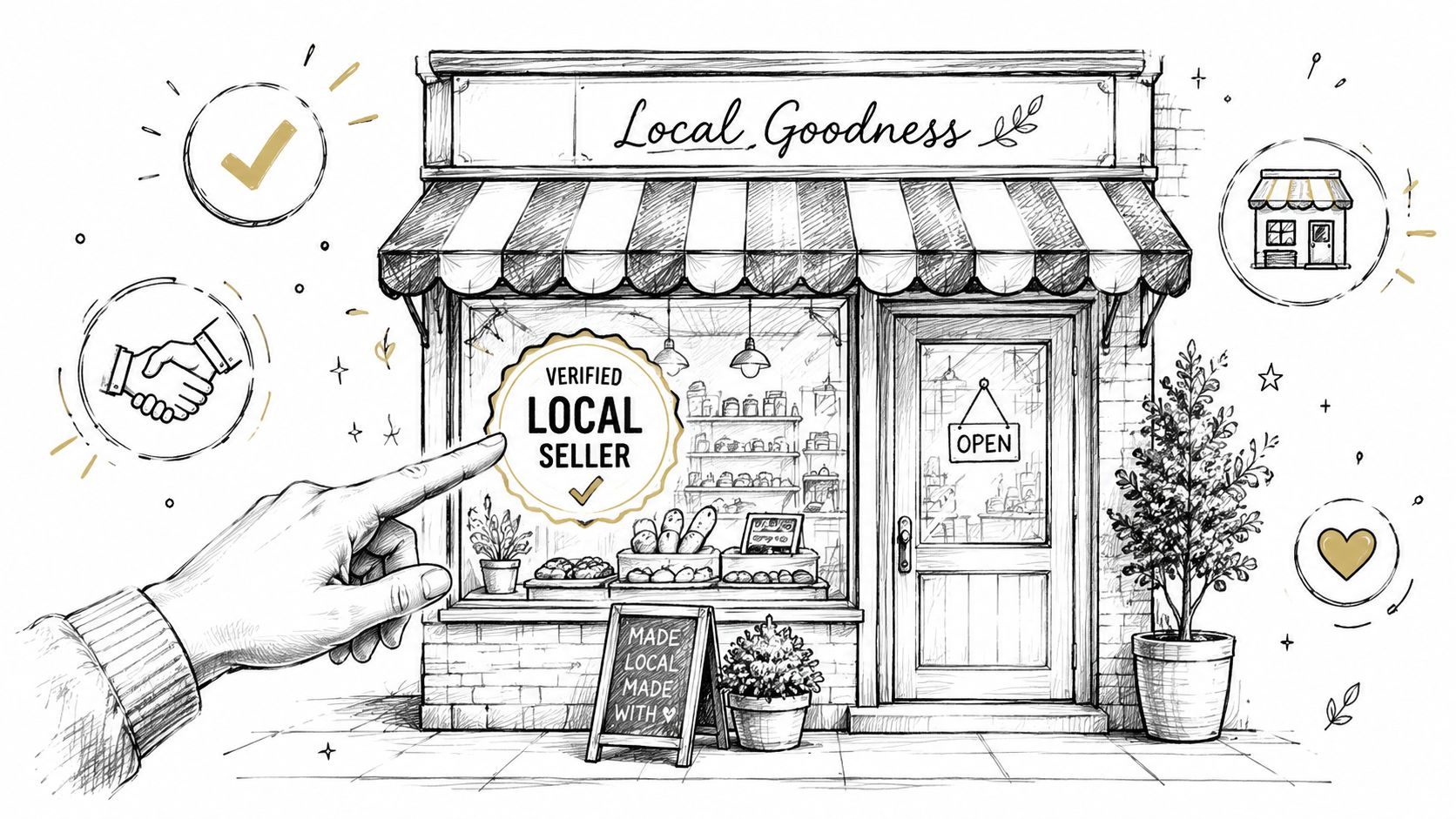
A plain receipt confirms payment. A trust-aware confirmation email confirms legitimacy.
Confirmation emails with explicit “Verified Local Seller” identifiers reduce post-purchase support inquiries by 29% compared to standard receipts, according to Tajo's order confirmation email guide. That's not a cosmetic add-on. It directly cuts the kind of worried messages local sellers get after checkout.
Use trust signals like:
- Verified seller label
- Platform-backed order assurance
- Direct support contact
- Return or refund policy link
- Privacy notice in the footer
Include legal basics without making the email feel cold
You don't need a wall of legal copy. You need the right details in the right place.
A good footer should mention the refund or return path, point to data handling terms, and make support easy to find. If you sell through a marketplace or platform, include the platform protection context in a short, readable line. For privacy language, link directly to the relevant policy, such as the Loyaltie privacy policy.
The buyer should never have to guess who is responsible if something goes wrong.
For local makers, trust signals do more than prevent support tickets. They reinforce what makes buying direct better. The product came from a real person, with no middleman, and the order still feels secure.
Measure Performance and Plan Ongoing Improvements
A confirmation email isn't finished when it sends. You need to watch how it performs and adjust the parts that affect trust, clicks, and support load.
The benchmark worth using here is straightforward. Order confirmation emails average a 70% to 85% open rate and a 15% to 20% click-through rate, according to Braze's benchmark data on order confirmation emails. If you're far below that range, something is off in your timing, subject line, template, or email content.
The metrics that actually matter
Track these first:
| Metric | Industry Benchmark |
|---|---|
| Open rate | 70% to 85% |
| Click-through rate | 15% to 20% |
Open rate tells you whether the message looks trustworthy in the inbox. Click-through rate tells you whether the content inside helps the buyer take the next useful action, usually checking order details, tracking, or support.
What to review every month
Don't overcomplicate this. Look at a small set of signals and use them to make direct changes.
- Subject line performance: If opens are weak, simplify the wording. Make the confirmation clearer.
- Support contact volume: If buyers keep asking where the order is or whether the maker is verified, your email is missing key reassurance.
- Link usage: If nobody clicks tracking or order details, those links may be too buried or poorly labeled.
- Template readability: Check the email on your own phone. If it feels annoying to scan, your customer already noticed.
- Category differences: Coffee, skincare, wellness, and pet products often need slightly different fulfillment language. Review performance by product type, not only across the whole store.
Run small tests, not big redesigns
Change one variable at a time. Test a cleaner subject line. Test moving the delivery note higher. Test one clearer support button. That's how you learn what reduces friction.
A lot of makers waste time redesigning the whole email when the core improvement is one line near the top: “Your order has been received and the maker is preparing it now.” Another common fix is replacing generic shipping language with a more honest local fulfillment note.
The long-term win
The strongest confirmation emails don't feel automated, even when they are. They feel precise. They reflect how the order will move. They prove the seller is real. They make buying directly from independent brands feel easier than buying another forgettable product from a giant catalog.
That matters because people are already leaning toward local. At least $68 out of every $100 spent locally stays in the community, according to Capital One Shopping research on shopping local. But your email shouldn't lean on guilt or civic duty. The better angle is still product quality, direct connection, and confidence after checkout.
If you tighten the order confirmation email, you don't just reduce confusion. You make buying from local makers feel polished.
If you want a cleaner way to help shoppers discover and buy directly from the best independent brands in the US, browse Loyaltie. It's a marketplace built for local commerce, with direct purchasing, platform-backed order confidence, and a simpler path for makers who want to sell online without a middleman.